Beacon Dashboard
Company
GoGuardian
Role
Lead UX Designer
About the Project
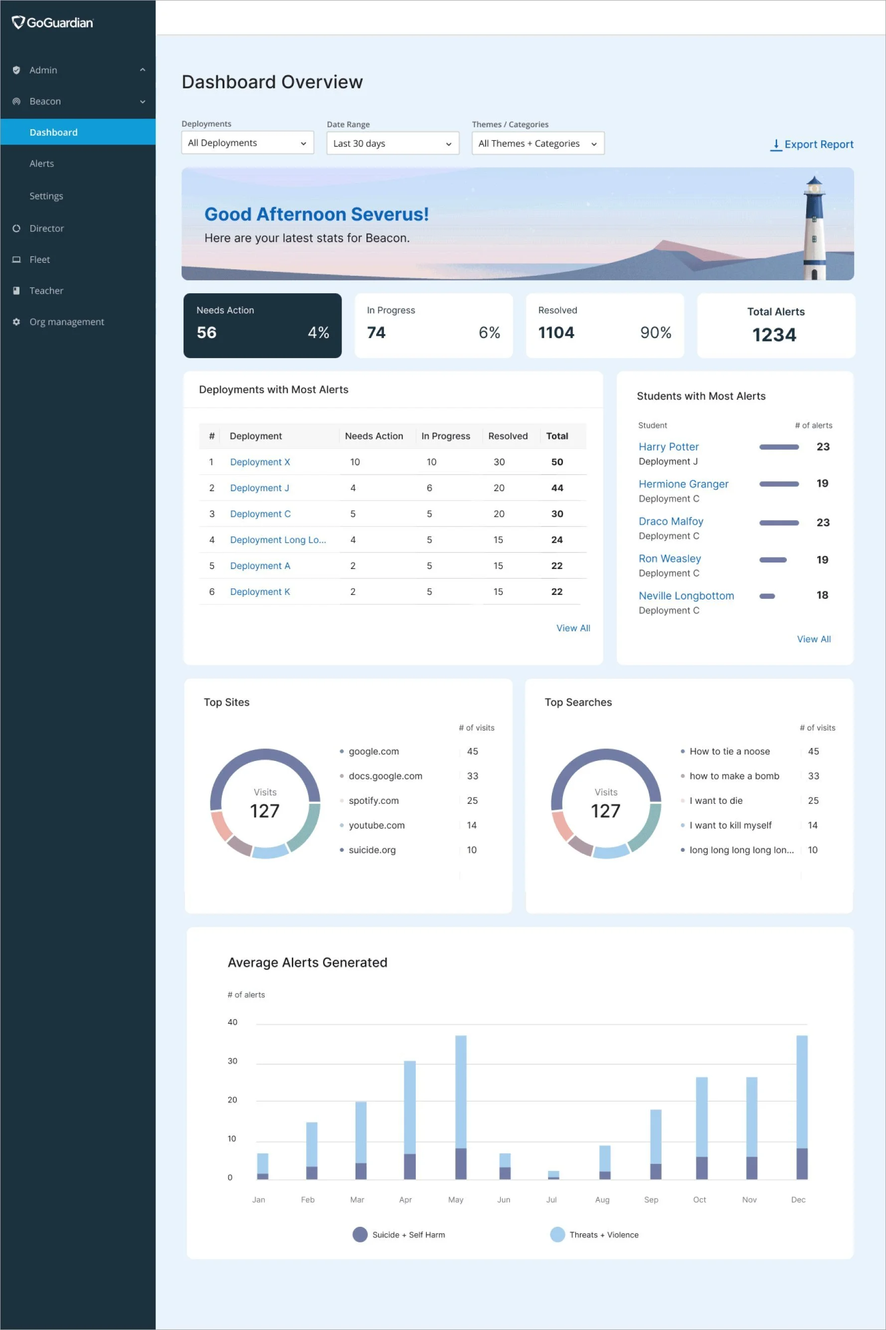
Beacon is a student suicide prevention tool used by school staff. A dashboard was designed to give enterprise customers from large school districts a high level overview to track alerts from different schools.
My Role
As the UX Design Lead, I served as the sole designer and took ownership of the following processes:
Research / Strategy / User Testing
Wireframes / Low + High Fidelity Prototypes
Leading research processes across design teams
Accessibility overhaul
Contributing to the existing Design System
Working with Data Science to improve the AI model
The Team
The Problem
The existing alerts page only served as a repository of generated alerts, which made it difficult for enterprise admins to track status of alerts across different schools for reporting.
Additional challenges included:
Threat of customer churn
No clear product requirements
Large design and engineering effort
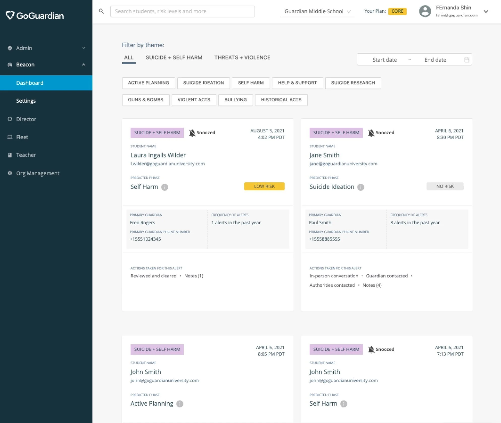
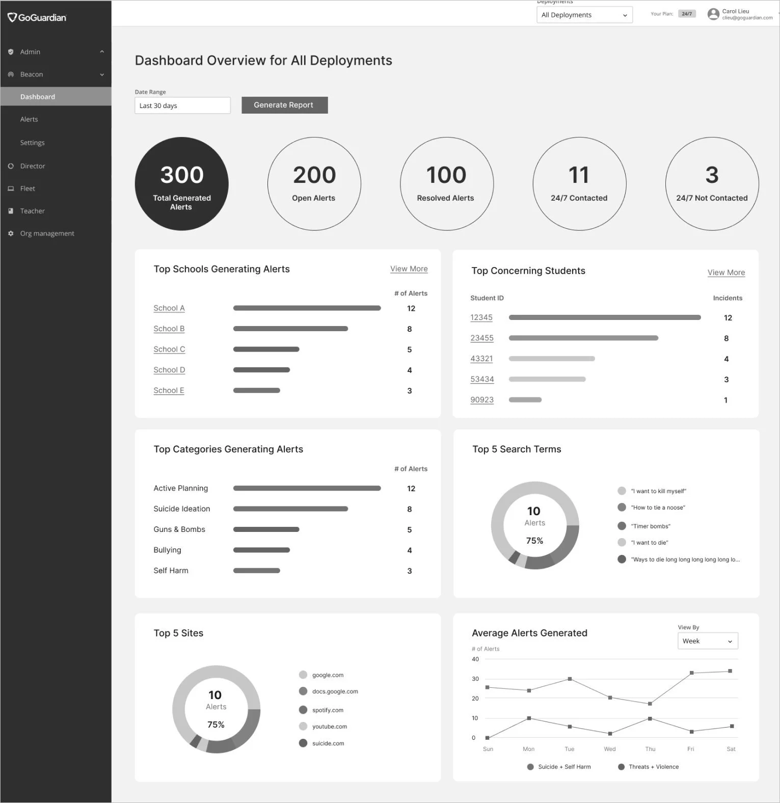
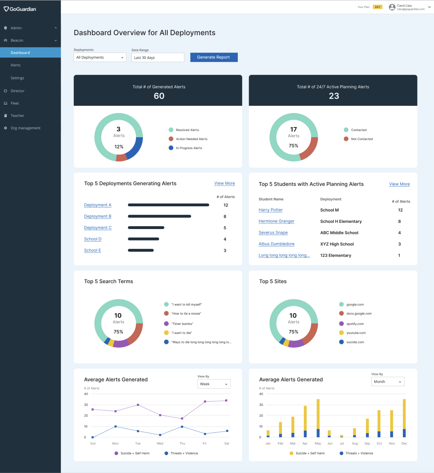
The below image is the alerts page for Beacon. If a student looks at any concerning activities on their Chromebooks, an alert card is generated for that student.
Users can click on the alert card to view more information and take the appropriate actions to resolve the alert.
Research + Discovery
Before diving into research, I had some questions I wanted to get clarity on:
What problem do we need to verify?
Which users will the new dashboard impact?
What are the different needs and user flows?
What top metrics do users want to see on the dashboard?
UX Project Plan
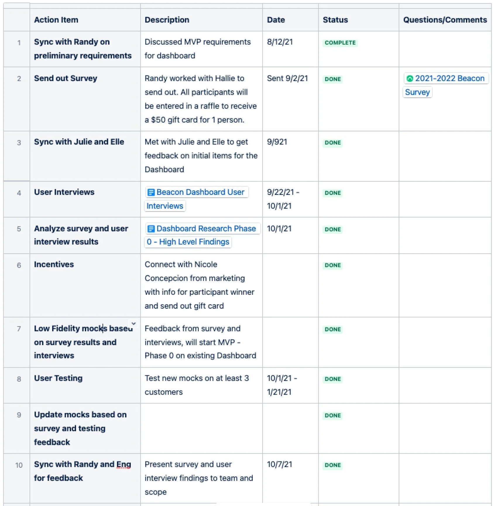
Keeping the above points in mind, I started off by creating a tentative UX Project Plan for stakeholders to keep track of my progress, access related resources, and comment along the way.
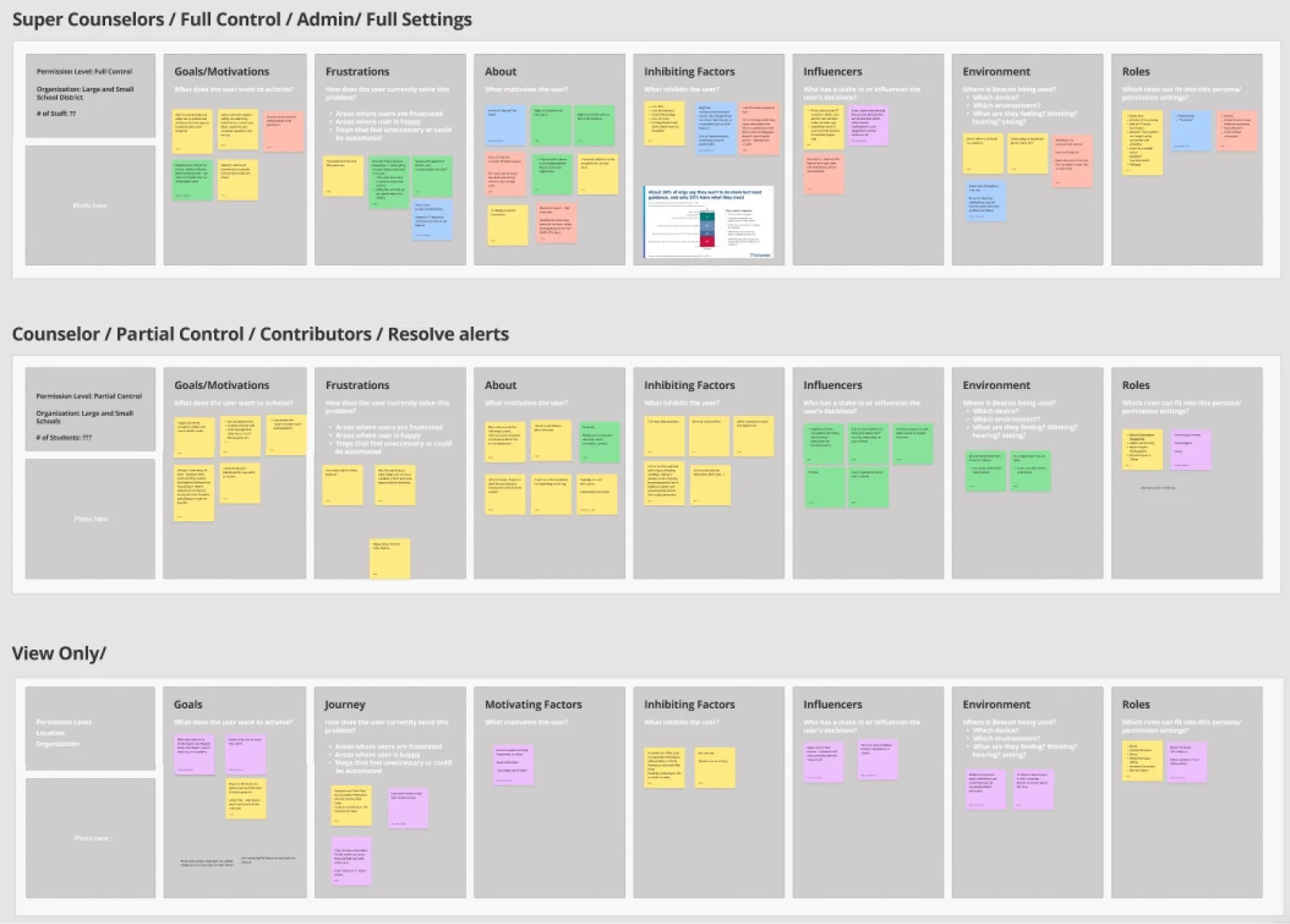
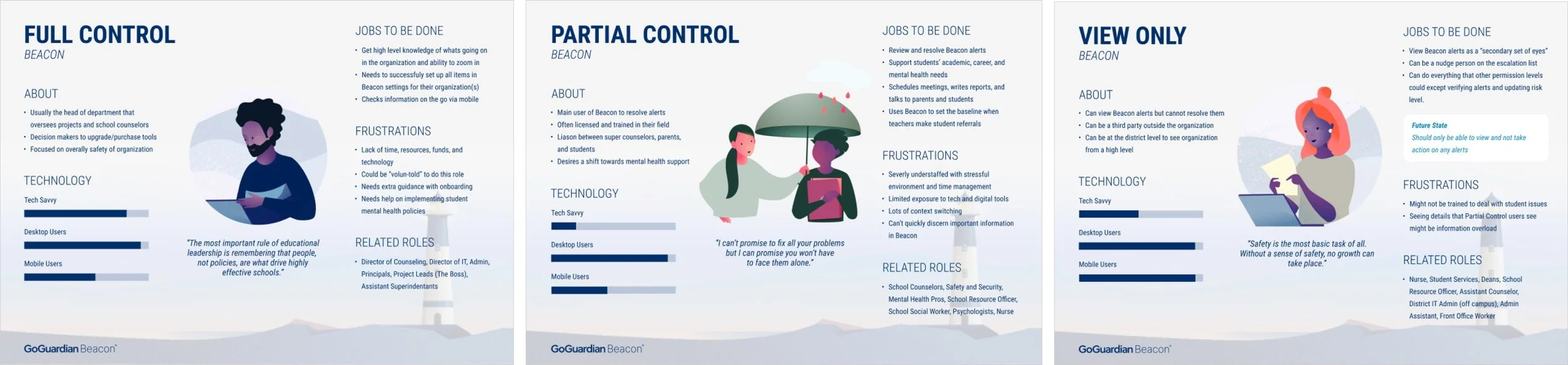
Users and Jobs to be done
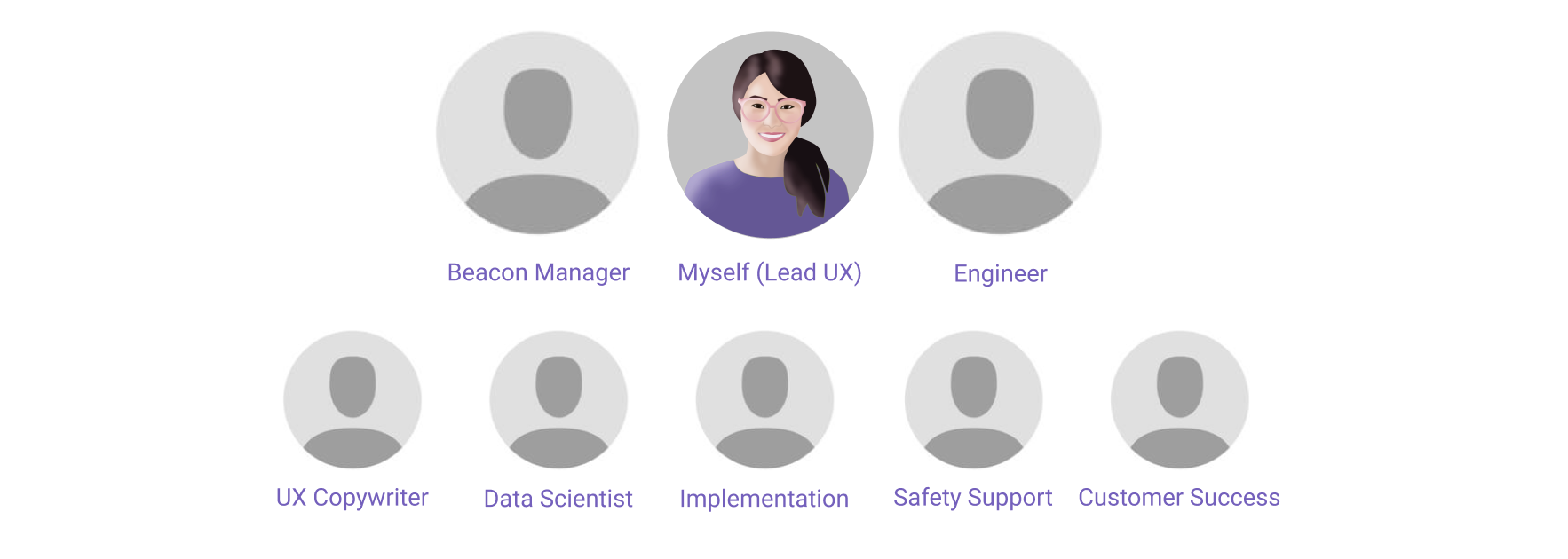
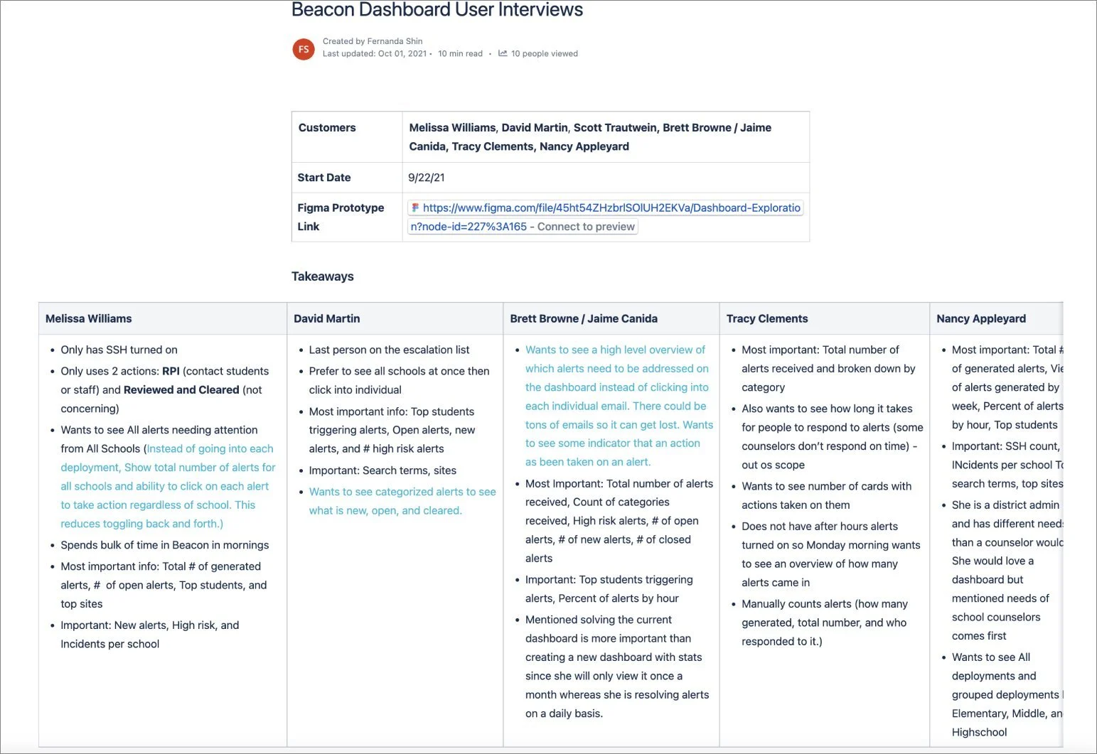
I wanted to dive deeper into the different customer types that would be using the new dashboard and facilitated a workshop with stakeholders who had extensive knowledge of the Beacon customer base. This workshop included the General Manager of Beacon, Product Manager, Customer Support, and Implementation Specialist. The goal of the workshop was to identify specific user types and their permissions levels depending on user goals, frustrations, influences, environment, and roles. Three different personas were created based on the activity.
Surveys
I sent out a survey to customers to get an idea of needs for the dashboard depending on the size of the organization and role. I also wanted to understand top information users expected to see on the dashboard.
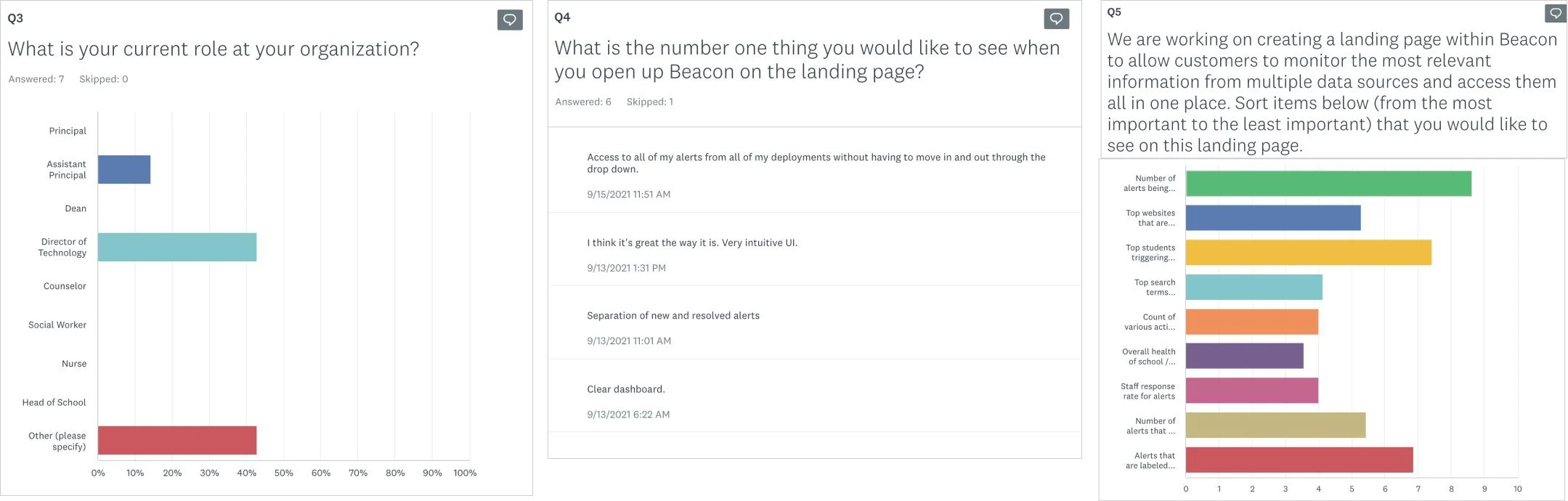
User Research Calls
I also spoke to 5 of our top customers to ask them a series of questions regarding their journey. This was followed by a drag and drop exercise to identify the most important metrics they wanted to see on the dashboard.
Sharing Findings
The research notes were taken within Confluence and synthesized to create a high level summary. The findings were presented to stakeholders along with UX recommendations based on feedback.
Designs
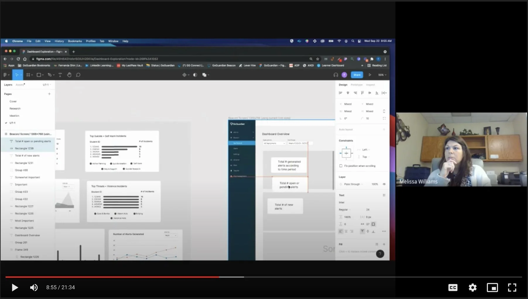
Low Fidelity Mocks
Once the stakeholders were in alignment of what we would be building for MVP, I started on some design explorations. The sorting activities during research helped me organize the most important information users wanted to on the dashboard. I explored various layouts and design options leveraging colors used in other GoGuardian product dashboards. I also shared the designs with the design team to get feedback.
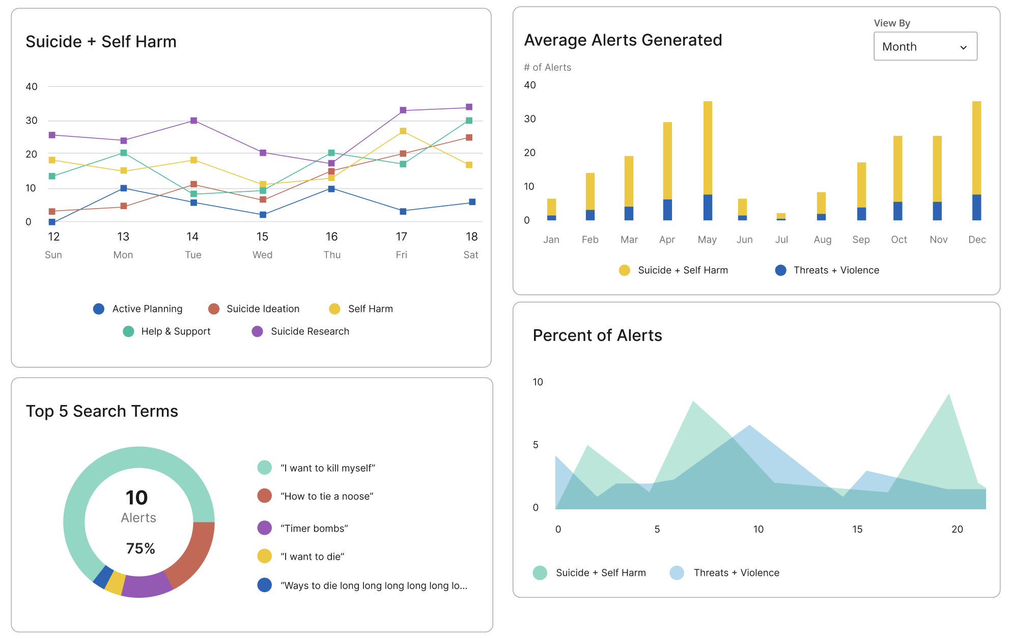
Data Visualization
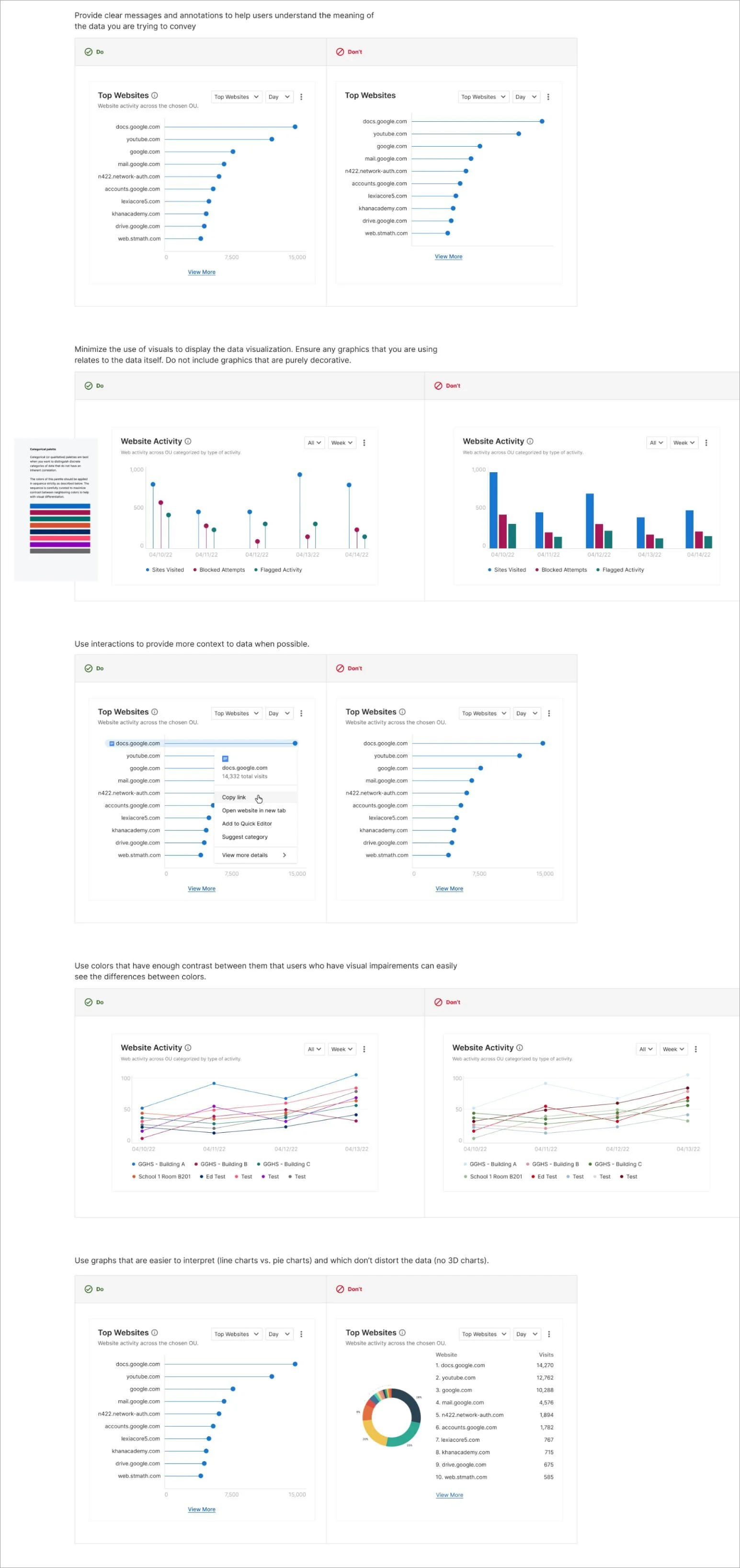
I explored various data visualization designs using the existing Ant-D framework for top metrics users requested to see on the dashboard. I also researched best practices by taking an online course on mastering data visualization and reading articles from Medium, interactiondesign.org, and the Nielsen Norman Group.
Adding Color
I explored various layouts and design options leveraging colors used in other GoGuardian product dashboards. I also shared the designs with the design team to get feedback.
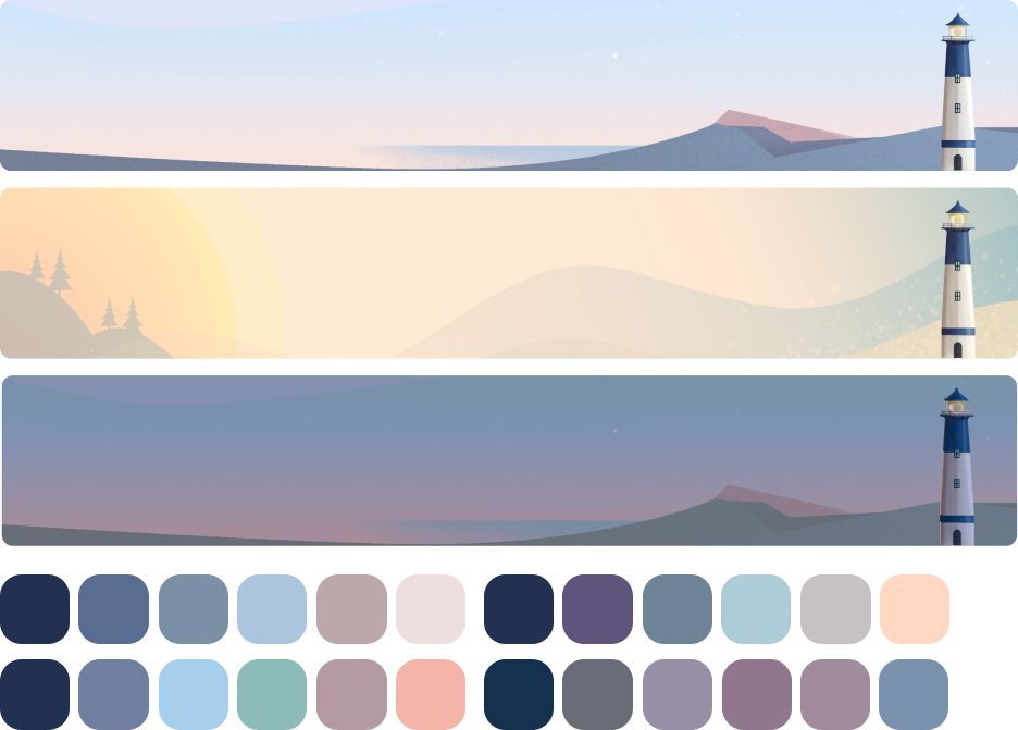
Color Exploration
Inspired by illustrations created by the Marketing team, I worked with a Graphic Designer to incorporate images and experiment with alternative color palettes for a softer look. This design got positive feedback from the team and we decided to go with this palette.
Accessibility
Before handoff to Eng, I worked with a third party accessibility vendor to walk through the mocks to get additional feedback and took notes to improve inclusivity in the designs.

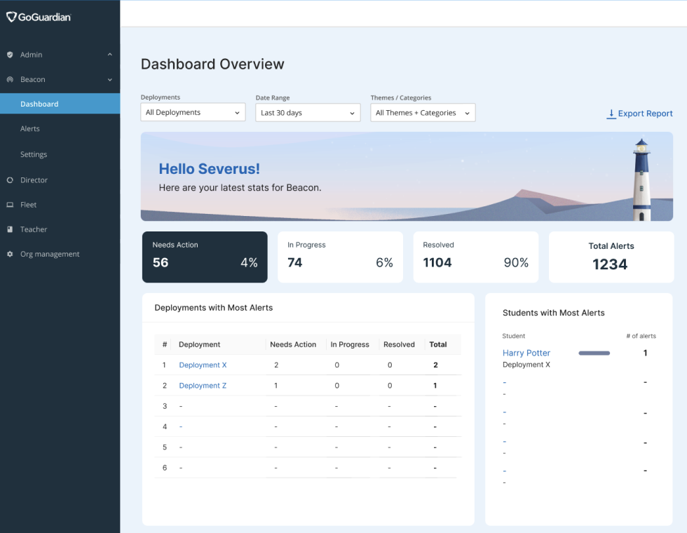
Final Design
For the final design, the layout was updated to draw attention to the most important information, the total number of alerts generated. An illustrative banner with a personalized greeting was added to create a more welcoming experience. The design also accounted for empty states and variations across three plan types: Starter, Core, and 24/7.

Impact
The launch led to a quick and measurable changes.
Increase in # of resolved alerts
14% increase in the number of resolved alerts after one month
Increase in NPS
38% increase in NPS, with frequent mentions of "prioritization," "saving time," and “clarity.”
Increase in revenue
helped secure over $700K in multi-year contracts across multiple school districts.
Positive qualitative feedback
“I can finally report to the board with real data—not just anecdotes.” - District Admin
“This lets me catch spikes in concerning behavior before they become full-blown crises.” - School Principal
“I finally have control instead of being buried under alerts.” - School Counselor
My Learnings
This project challenged me to lead through high ambiguity and complexity. With little upfront direction, I defined the problem space, collaborated closely with engineers and PMs to handle edge cases, and ensured the design met both user and business needs. It reinforced the importance of proactive communication, flexible problem-solving, and designing for scale in high impact environments.
Key Takeaways:
Clarity starts with ambiguity
With little upfront direction, defining the problem space and aligning stakeholders early was critical to driving focus and momentum.
Strategic collaboration is non-negotiable
Partnering closely with engineering and product was essential, not just for feasibility, but for navigating complexity and making informed trade-offs.
Design can unlock business value
A user-centered dashboard didn’t just improve the experience, it directly influenced over $700K in multi-year contracts.