Design System Integration
Company
Western Psychological Services
Role
Product Designer
About the Project
Western Psychological Services is a leading independant publisher of educational and psychological assessments for professionals in psychology and related fields. This case study outlines how I developed a scalable design system to support future product growth, enabling seamless collaboration between designers and engineers.
My Role
As the founding Product Designer, I independently led and took ownership of the following processes:
Discovery / Research
Defining strategy and roadmap
User Testing / Validation
Wireframes / Low + High Fidelity
Visual Design / Design System
Evangelizing UX across the company
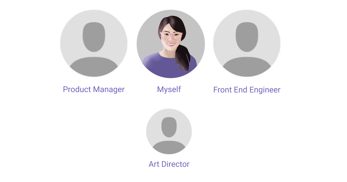
The Team
The Problem
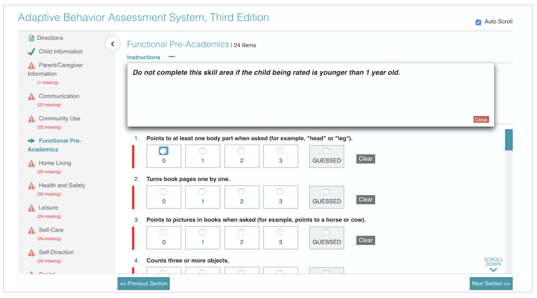
The Online Evaluation System (OES) is an online platform that gives practitioners the option to conduct and score assessments online. The OES was built without any guidelines or with the user in mind resulting in a high number of customer support calls. Some of the issues were:
The site had major accessibility violations
Feature were not scalable
Usability issues
Outdated design
Not responsive
The image below shows the an assessment within the OES interface prior to the redesign.
Research + Discovery
Stakeholder Buy-In
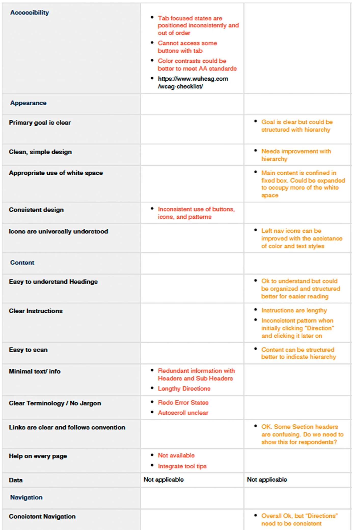
I started by conducting a heuristic evaluation of the assessments on the platform to uncover usability, accessibility violations, analyzed existing UI across products for inconsistencies, patterns, and redundancies and shared the findings to stakeholders as a first step to get buy-in for a design system.
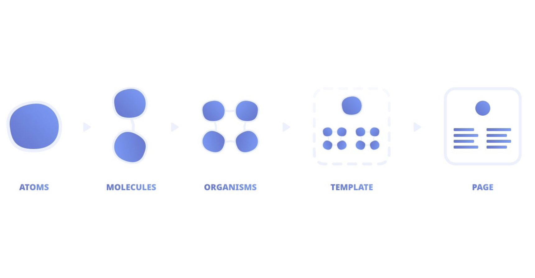
I led a company-wide presentation to introduce the benefits of a design system and inform the team on Atomic Design principles. The goal was to build alignment and secure official buy-in. Topics covered included:
Importance of scalability
Faster collaboration between design and engineering
Establishing consistency across products
Saving engineering time
Increase the quality of the brand
Build + Design
Defining Core Foundations
Once I got the green light to build a design system, I referenced various designs systems and frameworks such as Material Design, Polaris, Chakra and Bootstrap which helped me get an idea of how I wanted to structure the information.
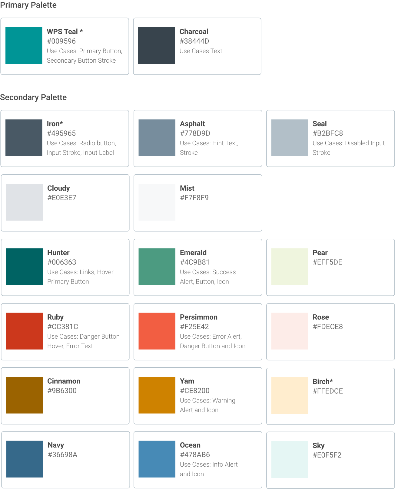
I began with the color palette. While there was an existing set of marketing colors, many lacked sufficient contrast and didn’t meet accessibility standards. I collaborated with the Art Director to create a revised palette, building on the original brand colors while ensuring compliance with accessibility guidelines.
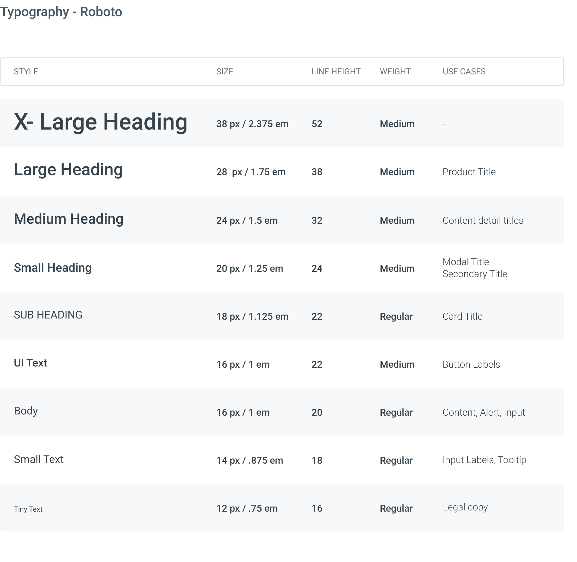
I collaborated with the Art Director to select Roboto as a complementary typeface to the print materials. Defining the type system was a valuable challenge because it pushed me to consider a wide range of use cases and accessibility considerations across different screen sizes. I used Typescale.com as a starting point and refined the typography to align with the needs of the digital product we were building.
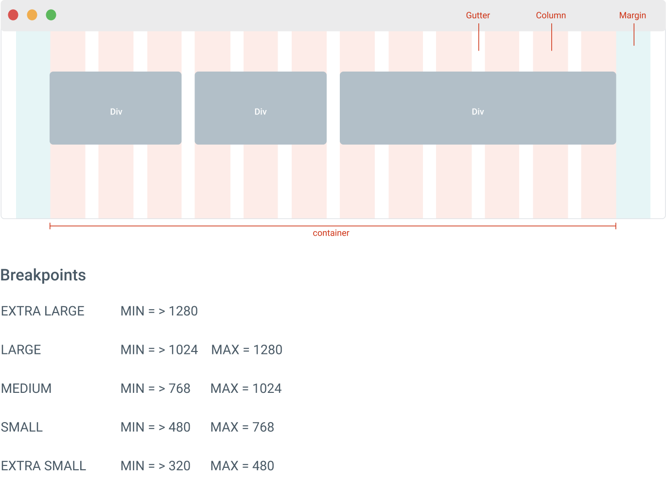
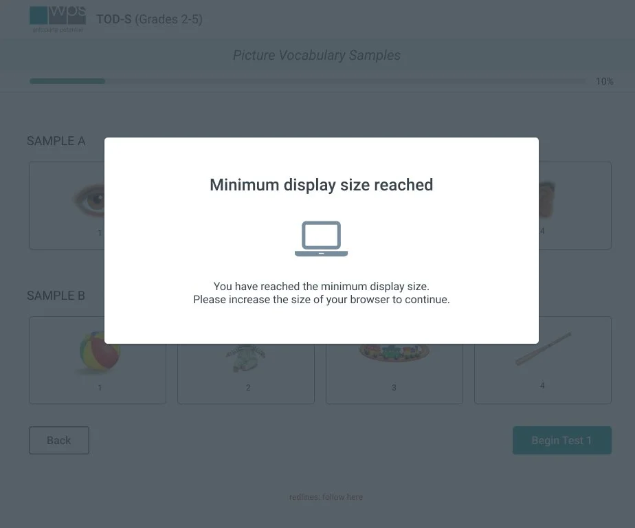
Since the existing assessments weren’t responsive, I created a flexible column grid system to ensure the design adapted seamlessly across all screen sizes and devices.
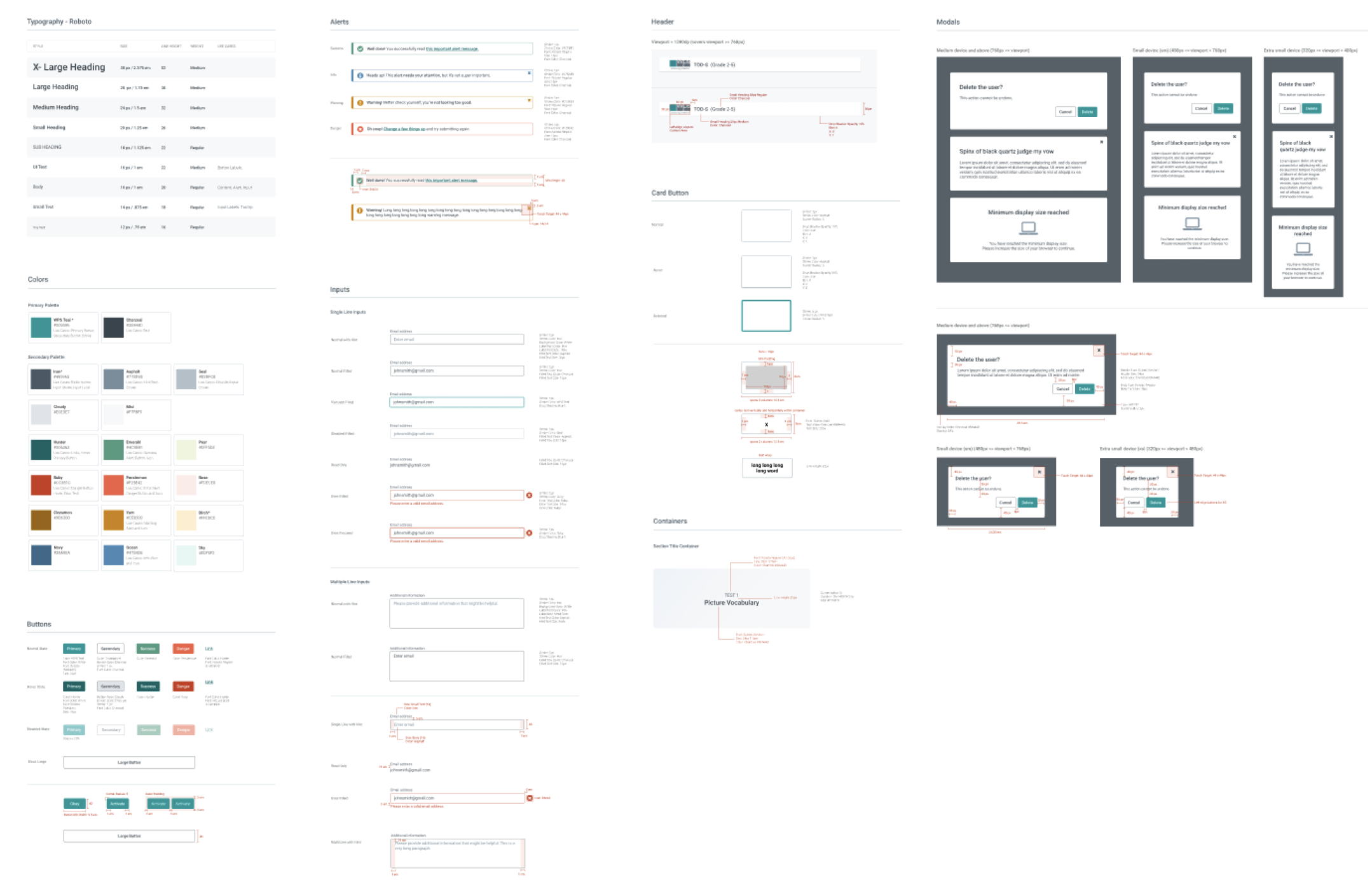
I also created button styles that accounted for various states, with fully documented specs to ensure clarity and ease of implementation for engineers.
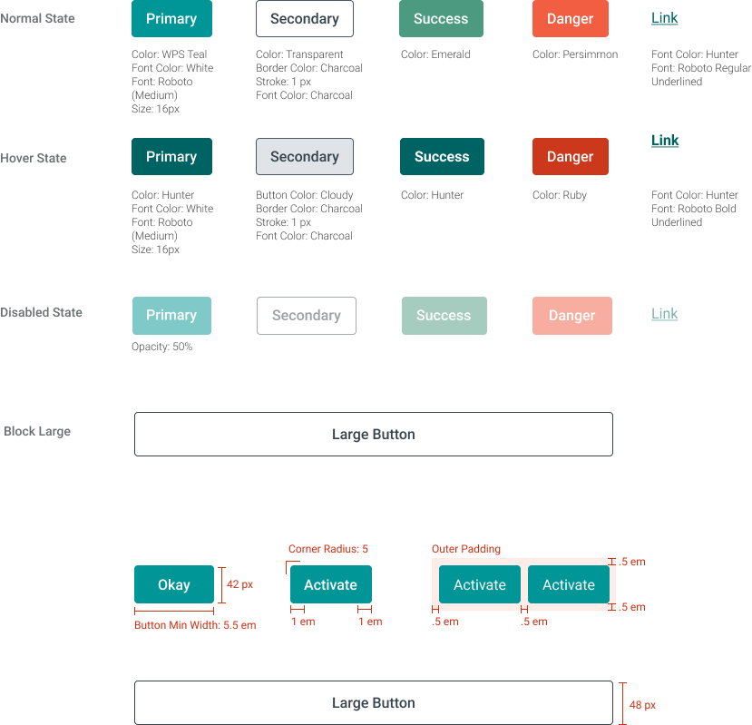
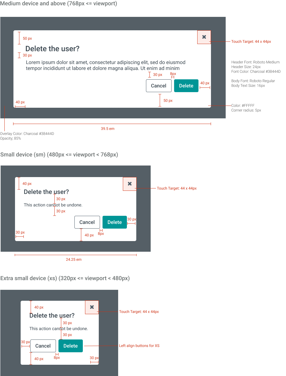
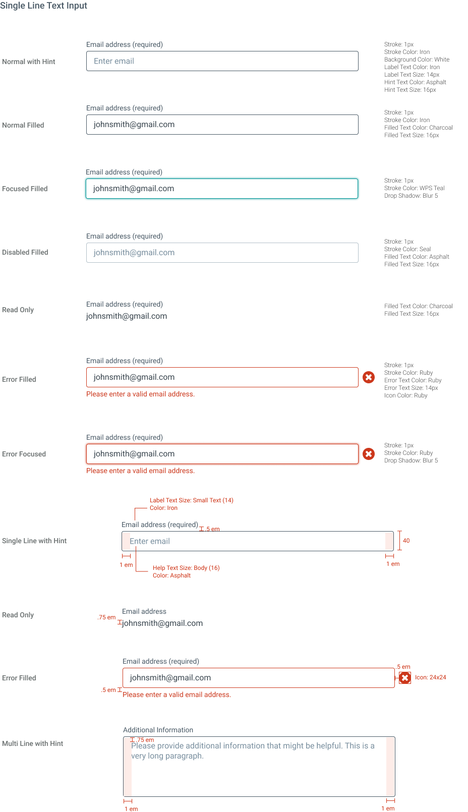
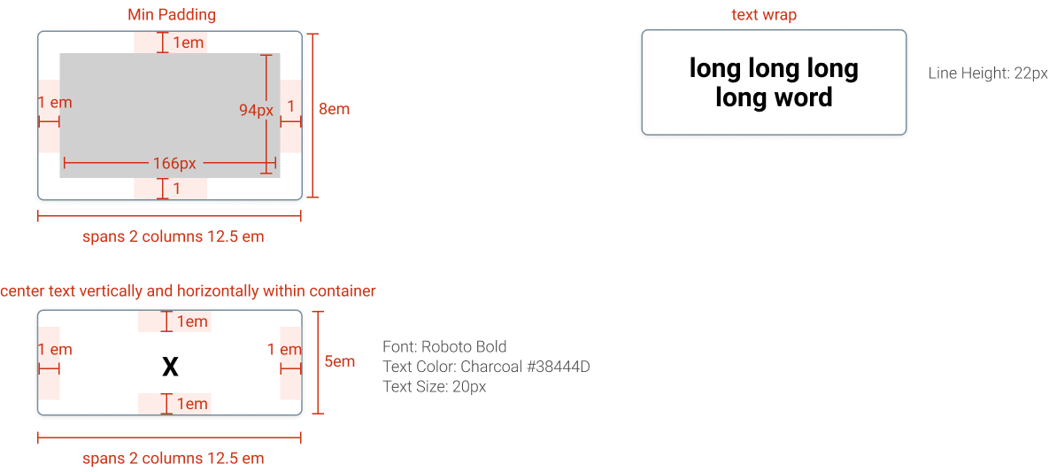
Below are additional examples of the design documentation I created, including modal layouts, button and card specifications, and form components which were all designed with responsiveness and scalability in mind across various screen sizes.
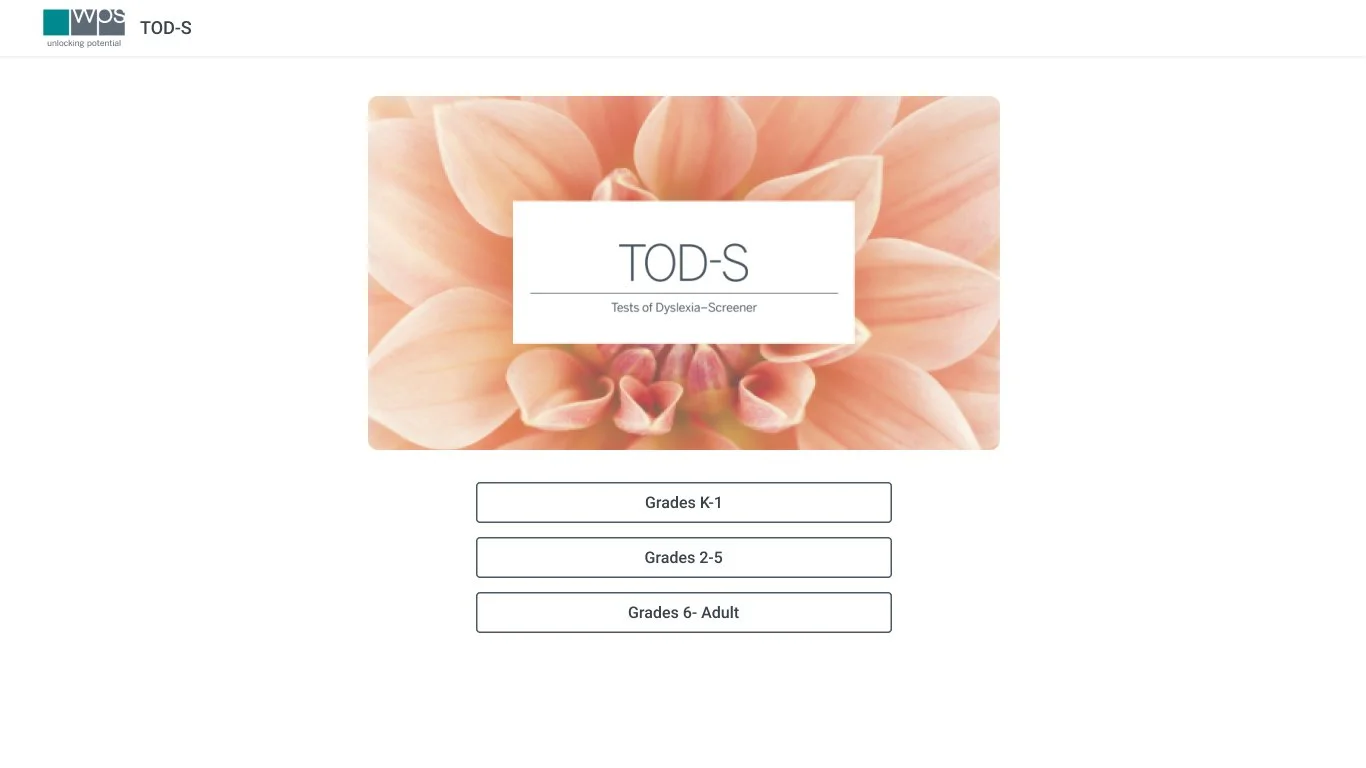
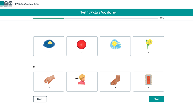
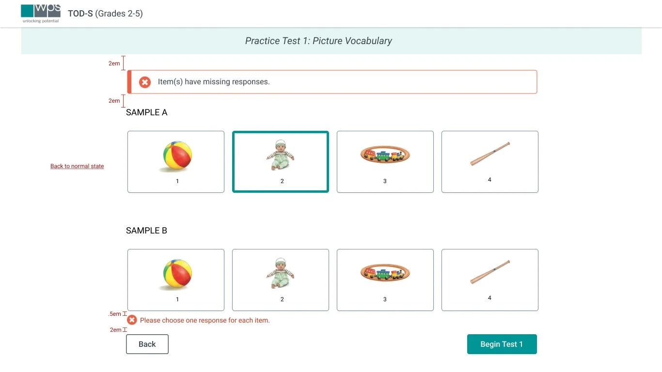
Design System Integration
The below image shows how the new design system was applied to the Test of Dyslexia. I replaced outdated UI patterns with system-aligned components: updated colors, modals, buttons, forms, and layout grids. This brought consistency, responsiveness, and improved usability to the product while preserving its core functionality.
Impact
After the release of the redesigned Test of Dyslexia assessment, we saw both measurable improvements and positive qualitative feedback from clinicians and internal teams. The new design system not only enhanced the user experience but also sparked broader adoption of accessibility practices across departments.
Positive feedback for Ease of Use
Customers reported that the new interface was intuitive and easy to navigate, resulting in high scores on the Ease of Use rating.
Cross-functional influence
The design system sparked broader conversations around accessibility. Graphic Design adopted the new accessible color palette and began considering font sizes and low-vision needs in their print materials.
Improved Design / Engineering collaboration
The system enabled more seamless collaboration with engineers and established a sustainable design process for future digital products.
Positive qualitative feedback
“It feels cleaner and less overwhelming. I can focus more on the patient and less on the website.”
“I love that it works on my tablet now!”
“I appreciate the larger fonts because it makes a big difference during long shifts.”
My Learnings
This project taught me how to approach design systems with flexibility and intention. Rather than aiming for perfection from the start, I focused on building a foundation that could evolve. I learned that a design system doesn’t need to be exhaustive on day one. It needs to be usable, scalable, and adaptable.
Key Takeaways:
Start small
A design system doesn’t need to include every possible component upfront. Starting with the most used elements created momentum and encouraged adoption.
Avoid one-size-fits-all thinking
Not every team or product needs the exact same solution. Flexibility in structure and usage helped meet the unique needs of different teams while maintaining consistency.
Track changes transparently
Keeping a version history and documenting updates ensured clear communication across teams, reduced confusion, and created a sustainable foundation for ongoing iteration.