Designing a Cohesive Classroom Experience
Company
McGraw Hill Education
Role
UX Designer
About the Project
McGraw Hill Education’s Open Learning platform serves K-12 and Higher Education students and instructors with tools such as Assignments, Tests and Quizzes, Gradebook, and more. As part of an overarching platform transformation, I led several UX initiatives that aimed to:
Merge the Assignments and Tests/Quizzes applications to improve workflow consistency and usability.
Improve accessibility for students with visual impairments by conducting firsthand research and implementing inclusive design.
Redesign the user interface across the platform to align with a new visual style guide and frontend framework.
Together, these efforts contributed to a more unified, accessible, and intuitive user experience for both instructors and students.
My Role
For this initiative, I was responsible for the following UX processes:
Research
Interaction Design
Low Fidelity Prototyping
Usability Testing
High Fidelity Designs
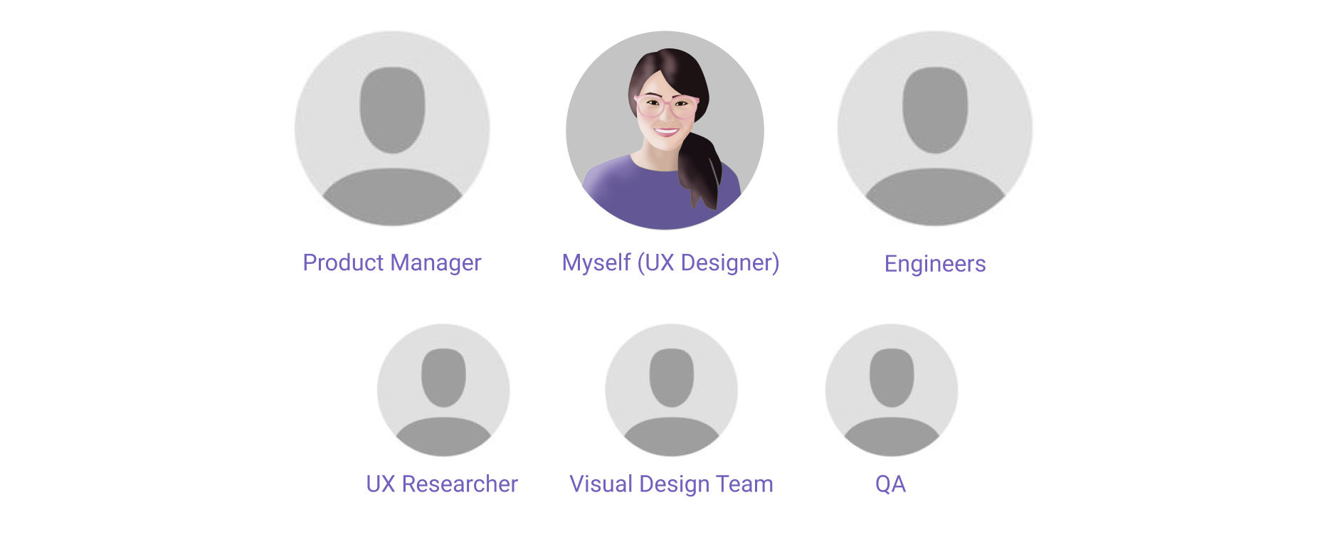
The Team
The Problem
The Open Learning platform was facing multiple challenges:
The Assessments and Assignments tools had overlapping functionality but separate workflows, creating confusion and inefficiencies for instructors.
The platform lacked sufficient accessibility support for students with disabilities, particularly for screen reader users.
A new style guide and frontend tech stack required a comprehensive redesign of all application interfaces to ensure consistency and maintainability.
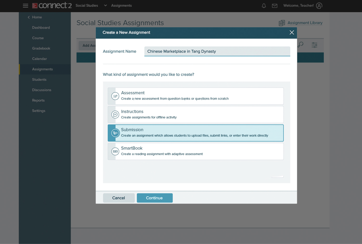
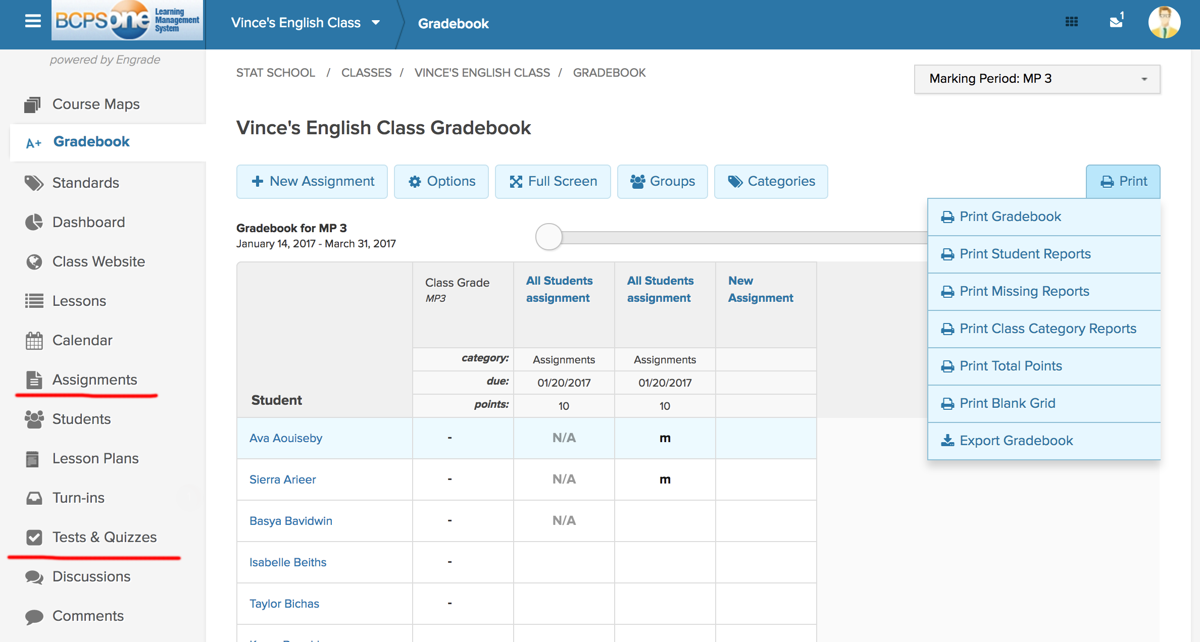
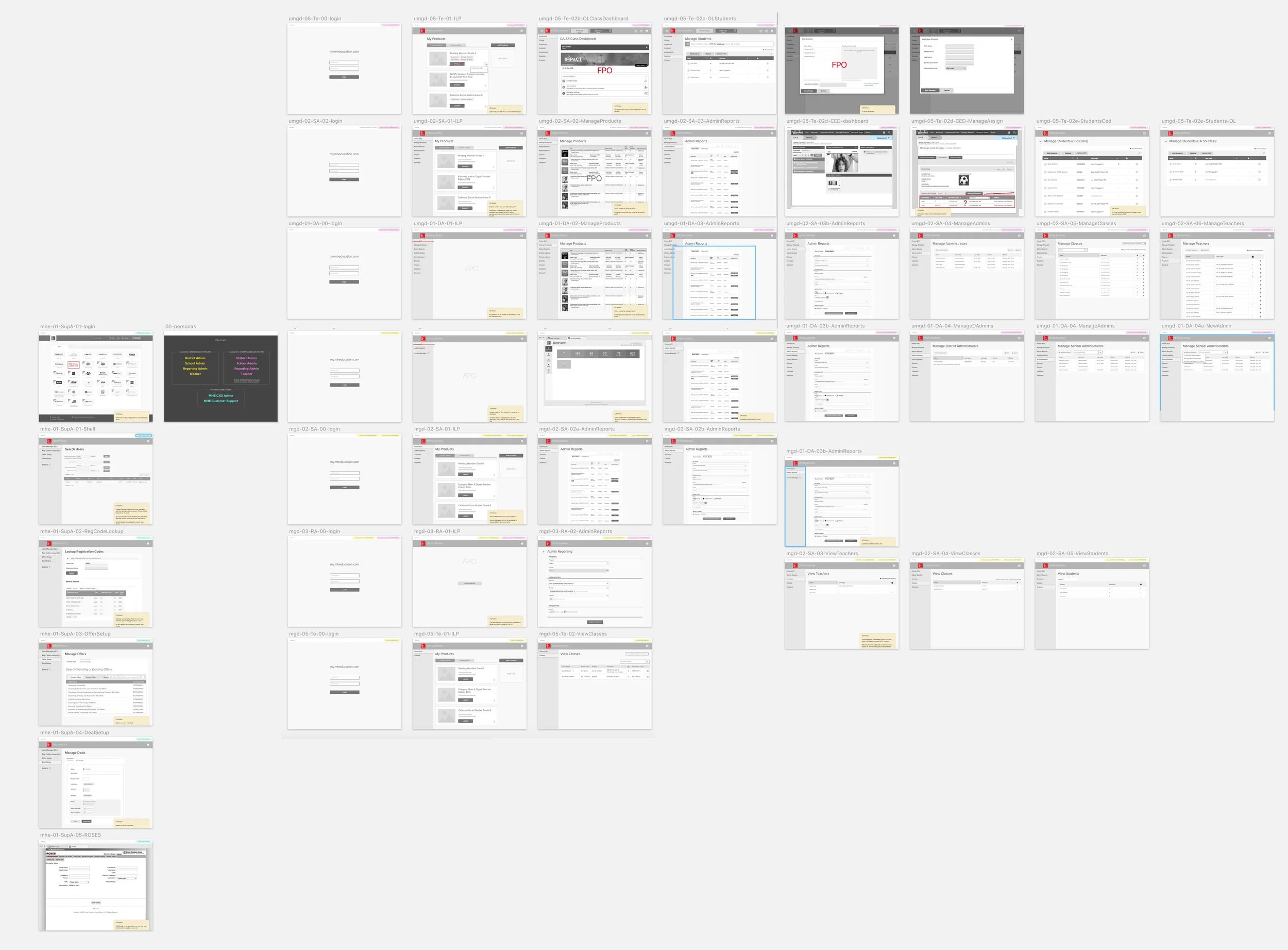
Below is an example of the existing interface looked like:
Research + Discovery
Instructor Interviews & Field Studies
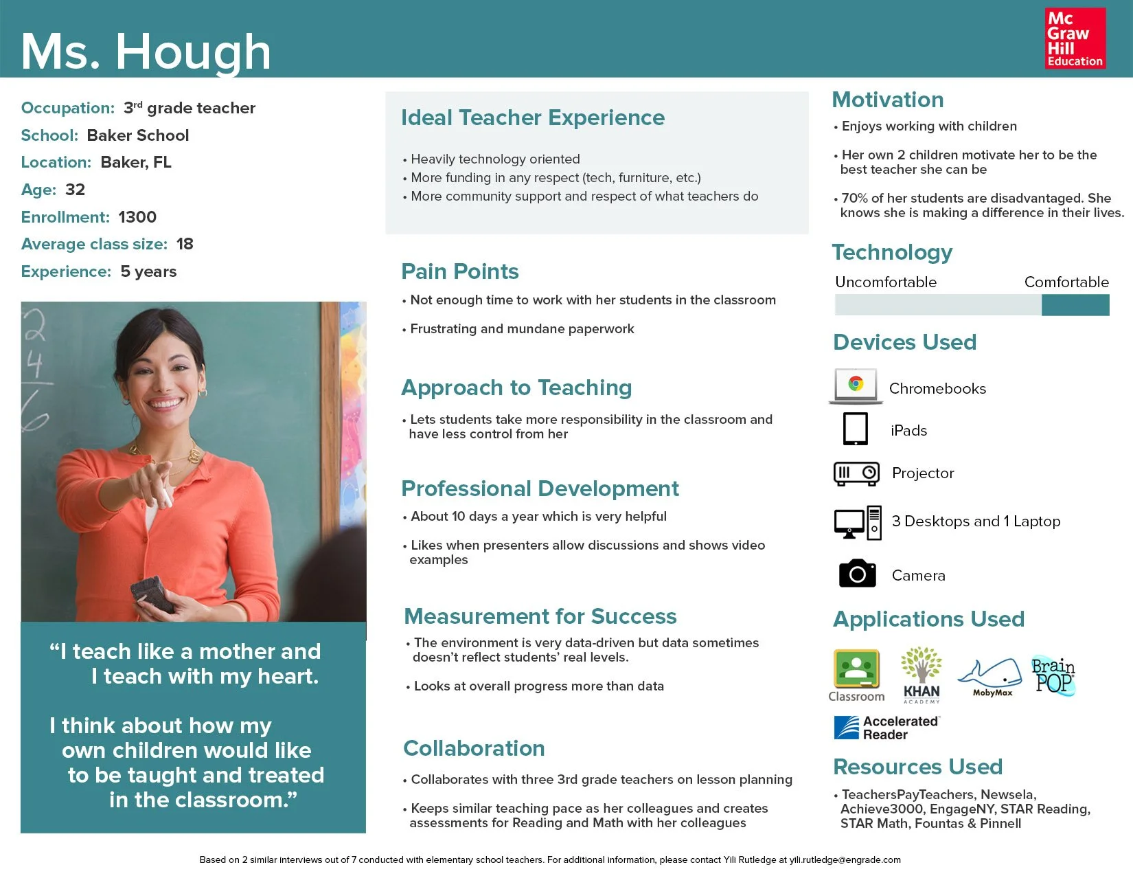
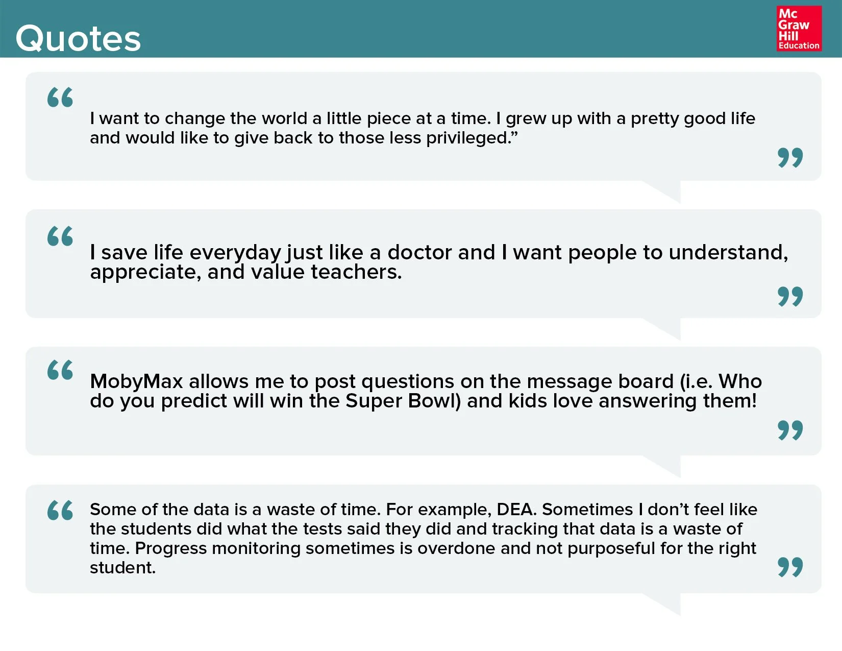
To deeply understand instructors' daily challenges, I partnered with the product manager and visited multiple K-12 schools across Southern California. We conducted 4 in-person interviews with 3 teachers and 1 principal, focusing on:
Goals and motivations
Daily classroom routines
Collaboration patterns
Devices used
Pain points and redundant tasks
From these insights, we created detailed user personas that helped our team align on real-world needs and behaviors.
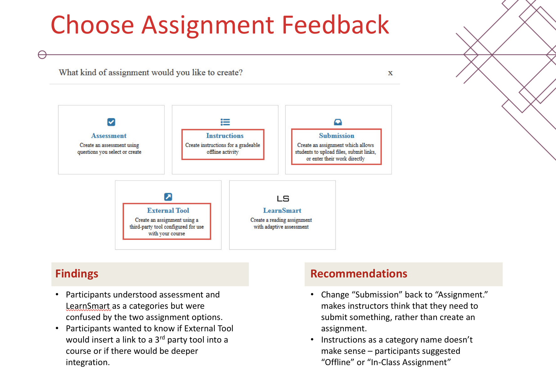
Terminology & Prototype Testing
Working with a UX Researcher, we conducted remote 1:1 sessions with 10 instructors across K–12 and Higher Ed. Our goals were to:
Understand how users defined "assignments" vs "assessments"
See if interface labeling caused friction or misalignment with mental models
Test early wireframes for flow clarity and language effectiveness
Key insights:
"Assignments" were seen as practice-oriented and collaborative.
"Assessments" were viewed as final, graded, and independent.
Users appreciated the combined workflow but flagged issues with labeling, navigation, and wayfinding.
Cross-Platform Visual Design Integration
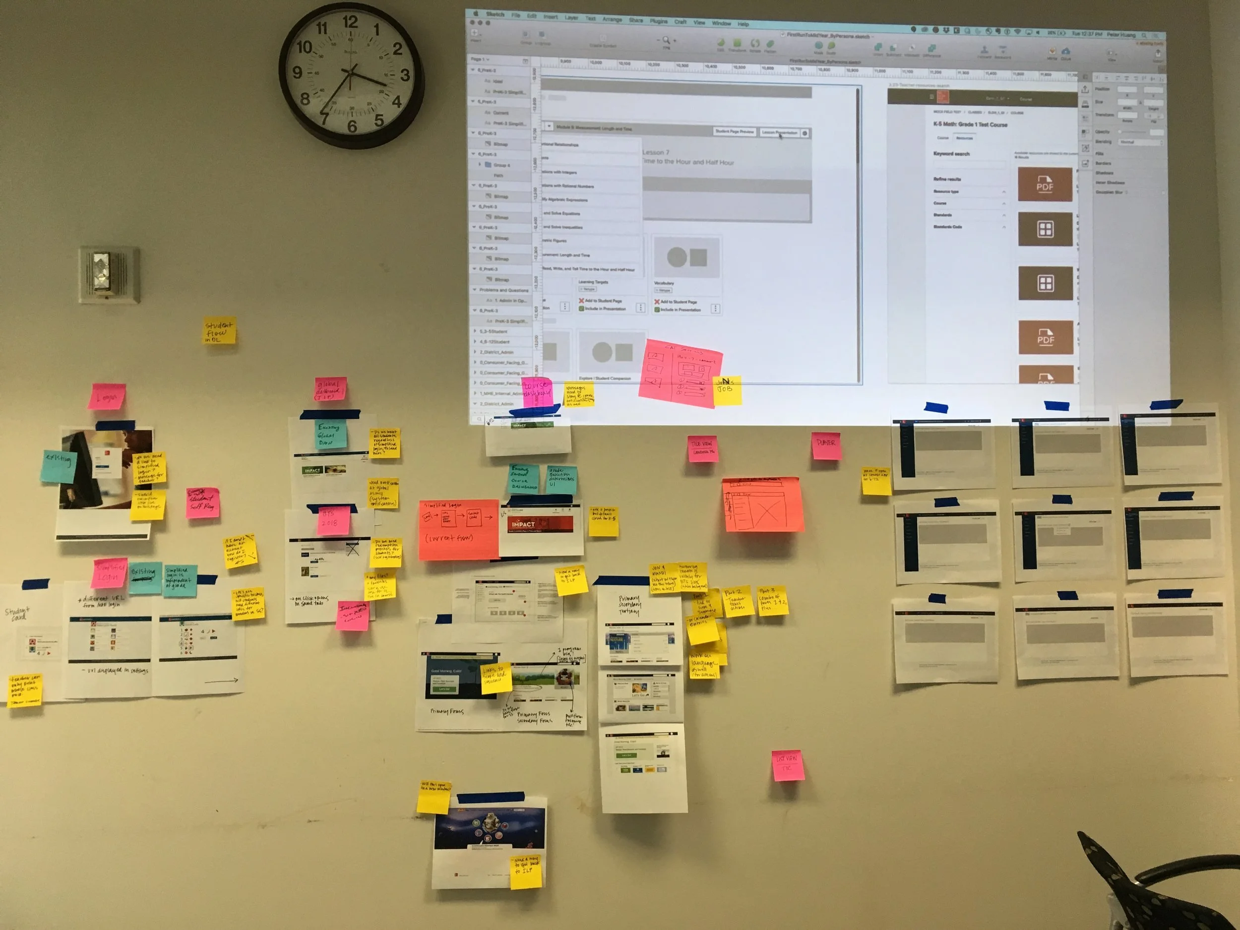
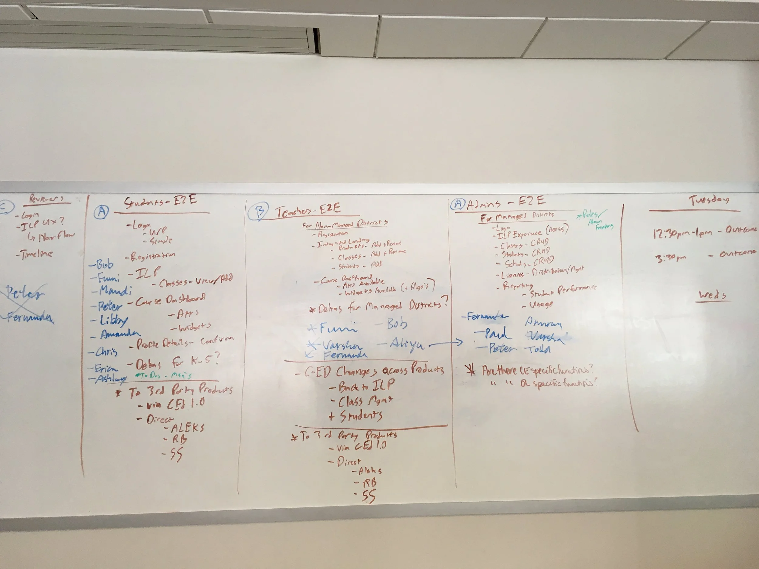
As McGraw Hill moved to a new global style guide and Angular-based front-end, ensuring consistency across products became critical. To align design and technical teams, McGraw Hill hosted a 5-day cross-functional workshop in Columbus, Ohio, where product and design teams from across the country gathered to:
Define shared visual goals for the Open Learning platform
Identify overlapping UI patterns across applications
Explore workflow changes impacted by the new visual system
Co-create end-to-end prototypes to stress-test style guide rules
I collaborated with visual designers, UX leads, and engineers to audit current interfaces, propose unified solutions focusing on the Assignment / Assessment flows.
Designs
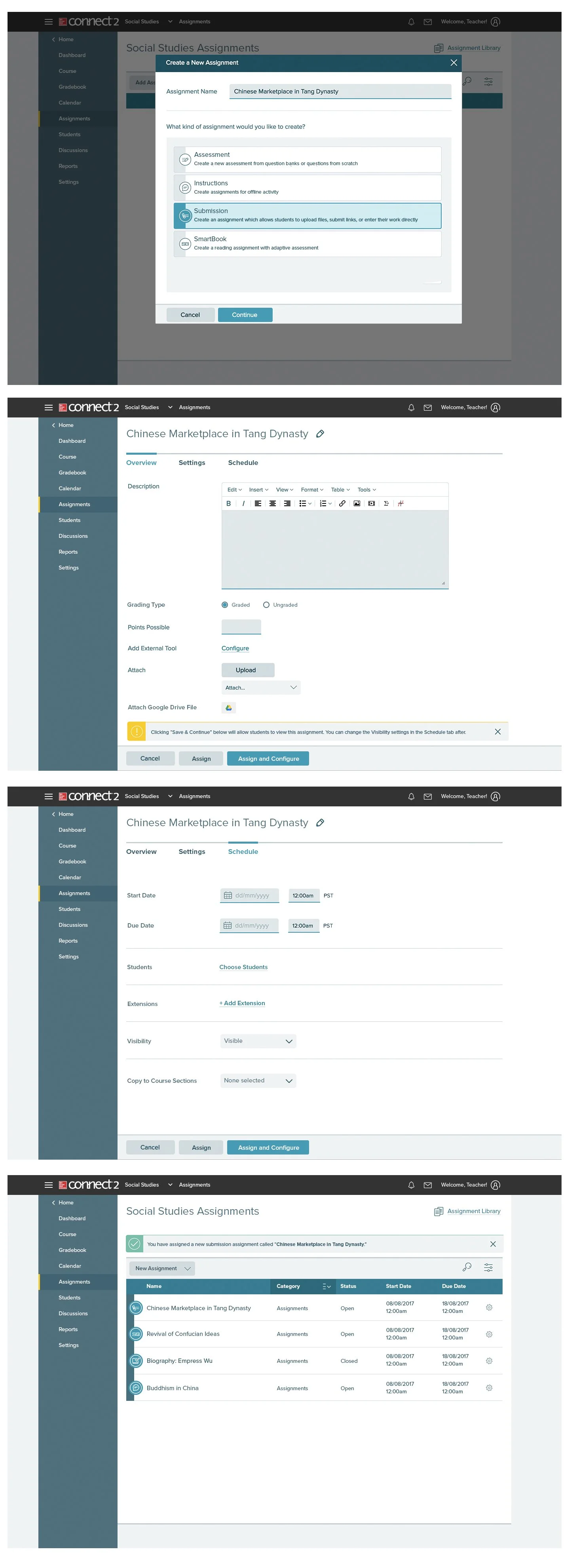
Low Fidelity Mocks
Combining insights from user interviews, terminology studies, and cross-functional workshop, I created low-fidelity mockups that unified workflows, clarified language, and addressed usability gaps. Key design decisions included:
A single entry point for all instructor tasks
Differentiated task types within a consistent flow
Clear preview and grading options tied to GradebookThese prototypes laid the foundation for iterative testing and design refinement.
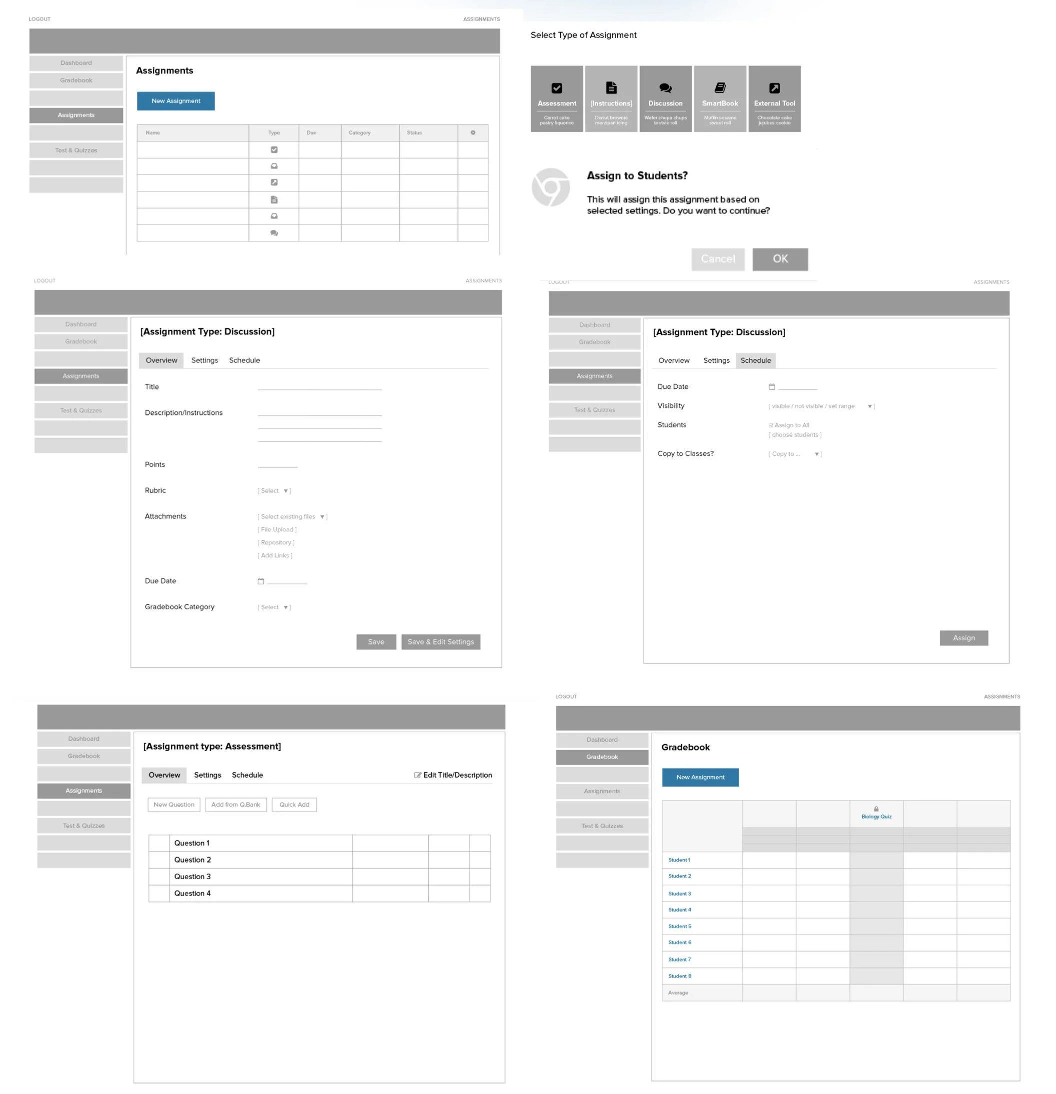
High Fidelity
After incorporating additional feedback from the team for feasibility , I developed high-fidelity prototypes. I collaborated with a UX Researcher to run quick moderated usability tests with 4 full-time Higher Ed instructors.
Test tasks included:
Creating an assignment (e.g., Submission Homework)
Creating an assessment
Adjusting Gradebook settings
Findings:
Participants easily understood the new flows.
Most pain points involved group assignments and missing features from their LMS.
Feedback led to key improvements before engineering handoff.
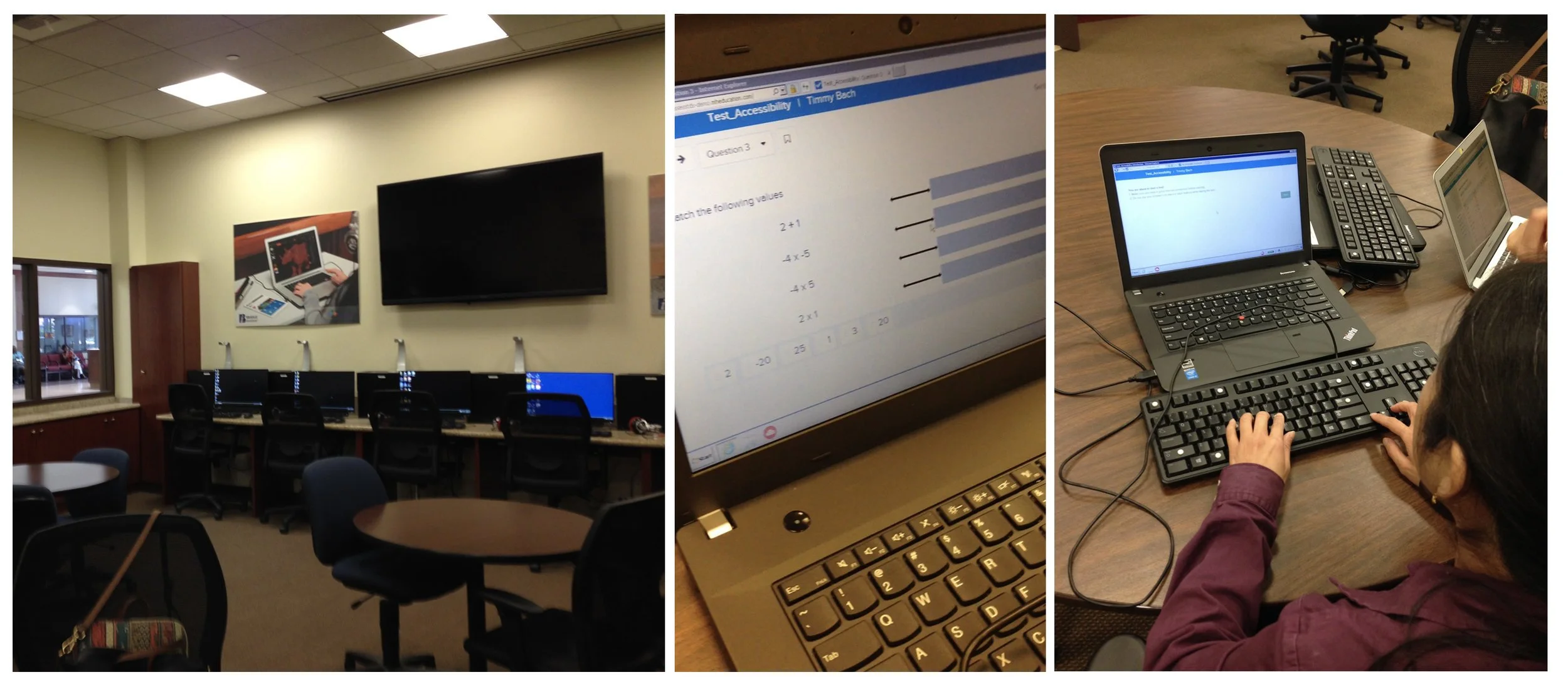
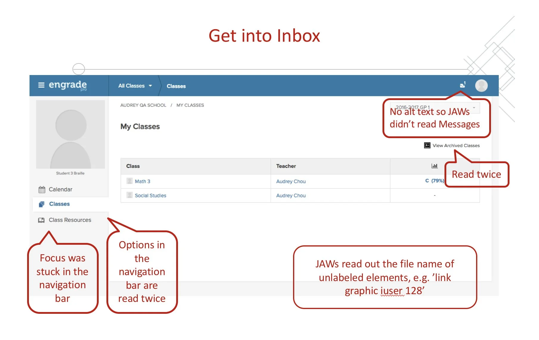
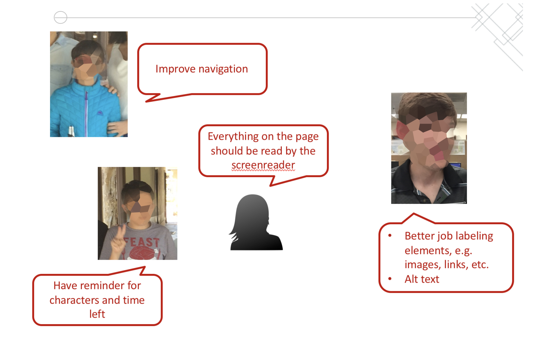
Accessibility Audit
As part of our accessibility efforts, I collaborated with engineers to bake accessibility into the new designs. We also worked closely with the Braille Institute to conduct user testing on the student-facing platform, ensuring an inclusive experience for all learners. Testing with real users revealed essential accessibility pain points for screen reader users that traditional audits would have missed. We addressed:
Missing ARIA labels
Inconsistent tab order
Ambiguous button names
Impact
These initiatives led to measurable improvements in usability, accessibility, and cross-platform consistency:
Improved Instructor Efficiency
Merging Assessments and Assignments led to a 25% reduction in task completion time, based on comparative usability tests.
Higher Accessibility Compliance
Post-audit updates brought platform accessibility closer to WCAG 2.1 Level AA standards.
Design System Alignment
Transition to new visual styles and Angular ensured a scalable, consistent experience across all Open Learning tools.
My Learnings
Throughout this process, I learned several key insights.
In-person research yields deeper insights
Visiting real classrooms shaped our understanding far beyond remote interviews or surveys.
Labeling matters
Even familiar terms like "assignments" can confuse users when context isn't aligned.
Accessibility isn’t an add-on
Inclusive design must start early and involve real users with disabilities.
Cross-team alignment is critical
Centralized workshops and shared prototypes enabled smoother handoffs and unified experiences.